Frequency Tables and Histograms
-
Variable Types
-
Qualitative vs. Quantitative
It is important that you distinguish qualitative and quantitative variables because the statistical treatment is usually different for these two data types. Examples of qualitative variables are gender, eye color, whether you prefer cola or 7-Up, or your choice in the last presidential election. Variables like your height, number of miles from school, and number of siblings are quantitative variables. Later materials will consider some of the differences in statistical procedures as applied to each of the variable types. Generally speaking, statistical treatment of qualitative variables is more restricted. As an example of this, the average value for gender would have no meaning, even if we had coded females as 1 and males as 2, while an average for miles from school would be meaningful.
-
Discrete vs. Continuous
There is another divide between variables that were collected on the first day of class. The variable number of siblings could only have a whole number (integer) value. This is a discrete variable. On the other hand, since it is possible to measure the variable height to any degree of accuracy, the range of heights might be any number between 40 inches and 80 inches. We might find someone whose height is 58.345671234 inches if we had a very accurate measuring device. Height is an example of a continuous random variable, a variable whose values can lie in some interval of real numbers. Only quantitative variables can be classified as discrete or continuous--qualitative variables are always discrete.
-
-
Grouping Data From Frequency Tables
-
The number of classes depends on the number of numbers in your data set
In classifying numbers it is usually sufficient to define between 5 and 20 categories into which the numbers will be sorted. In most cases use equally spaced categories chosen so that each number in the data set will fall into one and only one category. In deciding on the number of categories and their boundaries, determine the number of numbers in the dataset and the smallest and largest value in the set of numbers. Once categories have been chosen make a tally sheet by placing each number in its proper category.
Choose categories and make a frequency tally for the following dataset consisting of SAT Math scores from the Focus Database introduced on page 54 of the Weiss textbook..
640, 530, 380, 510, 480, 460, 510, 410, 650, 590, 480, 660, 520, 510, 590, 520, 540, 390, 570, 570, 410, 550, 500, 600, 580, 560, 490, 580, 510, 640, 500, 520, 370, 610, 600, 610, 420, 430, 410, 550, 630, 590, 400, 480, 470, 680, 590, 350, 650, 440, 620, 400, 610, 470, 540, 540, 480, 370, 480, 370, 500, 570, 570, 550, 530, 420, 310, 600, 590, 520, 610, 560, 340, 610, 580, 490, 600, 520, 470, 540, 650, 540, 700, 460, 650, 420, 520, 630, 460, 460, 590, 570, 400, 470, 440, 450, 550, 570, 660, 480, 640, 550, 720, 380, 540, 410, 480, 430, 540, 320, 500, 480, 570, 500, 290, 460, 500, 550, 630, 460, 470, 370, 480, 490, 630, 510, 650, 480, 530, 480, 540, 670, 430, 380, 420, 380, 550, 590, 500, 540, 480, 350, 590, 480, 520, 480, 430, 460, 530, 560, 390, 310, 550, 590, 500, 520, 500, 430, 430, 430, 570, 520, 510, 380, 610, 480, 510, 480, 560, 690, 370, 420, 400, 390, 600, 540, 640, 660, 460, 560, 450, 510, 390, 610, 320, 660, 440, 600, 440, 490, 600, 450, 450, 620, 400, 480, 320, 490, 520, 420, 480, 710, 560, 710, 560, 510, 340, 420, 420, 580, 600, 540, 520, 450, 370, 570, 350, 500, 410, 520, 380, 490, 570, 330, 450, 580, 720, 540, 710, 430, 640, 640, 730, 550, 500, 370, 390, 530, 570, 490, 580, 560, 550, 420, 530, 390, 610, 520, 610, 610, 560, 460, 490, 490, 520, 420, 350, 440, 440, 530, 530, 450, 430, 410, 570, 500, 490, 630, 510, 610, 520, 310, 620, 640, 630, 520, 740, 600, 640, 350, 570, 540, 680, 520, 470, 590, 430, 550, 500, 590, 490, 580, 570, 520, 490, 430, 700, 510, 750, 490, 680, 500, 530, 690, 490, 430, 460, 590, 410, 700, 520, 660, 500, 560, 500, 400, 350, 320, 530, 450, 580, 680, 410, 490, 480, 580, 530, 600, 740, 520, 350, 520, 590, 400, 390, 330, 460, 410, 640, 460, 430, 520, 590, 520, 450, 650, 470, 510, 590, 700, 270, 350, 520, 700, 650, 410, 470, 460, 520, 590, 490, 540, 490, 610, 680, 590, 430, 640, 540, 600, 470, 360, 580, 590, 520, 410, 660, 400, 420, 570, 390, 630, 530, 490, 670, 700, 480, 430, 520, 540, 570, 650, 570, 550, 490, 380, 350, 600, 410, 510, 540, 400, 450, 420, 520, 530, 580, 460, 490, 510, 520, 610, 550, 460, 470, 640, 460, 440, 470, 400, 650, 600, 550, 570, 380, 630, 560, 430, 390, 380, 550, 580, 600, 450, 590, 340, 470, 460, 420, 450, 260, 450, 540, 520, 540, 500, 460, 480, 570, 590, 530, 540, 440, 520, 700, 400, 510, 560, 560, 600, 690, 630, 650, 480, 570, 420, 560, 410, 660, 550, 610, 510, 530, 550, 600, 610, 340, 690, 410, 520, 470, 460, 660, 420, 540, 720, 560, 600, 540, 440, 430, 500, 560, 570, 510, 630, 600, 490, 530, 610
You can view and interact with the entire Focus Database from within WebStat by following the next link.
-
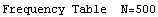
Frequency and Relative Frequency Tables
In constructing a frequency table for a single dataset you may only want to keep track of the number of values in each group. In comparing information from two datasets, you will want to make a relative frequency table where the relative frequency for a group is equal to the frequency for the group divided by the total frequency. The next table shows both a frequency and relative frequency tables for the above SAT math scores.
-
-
Resources
Section 2.2 of the Weiss textbook has more information on constructing frequency tables.
-
Histograms and Bar Graphs
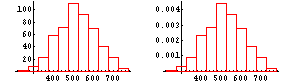
Frequency tables and histograms are closely connected--histograms provide graphical representations of frequency tables. The next display shows the frequency and relative frequency histograms for the frequency and relative frequency tables just above. Section 2.3 of Weiss introduces histograms and other graphical displays.

A histogram looks different as class widths are varied. When class widths are too small, the histogram will have too many bars, preventing you from recognizing patterns, while class widths that are too large will mask the general shape of the data set.
If you haven't opened the Focus database by clicking the orange button above, do that now. When Webstat opens make a histogram of the SAT Math scores by selecting Histogram under the Graphics menu in that application. Try different starting points and interval widths. After trying them what statement(s) can you make about the SAT Math scores for sampled Arizona State University Sophomores.
-
Stem and Leaf Plots
-
Principles
Stem and Leaf Plots display information much like a histogram rotated through 90 degrees. In some cases individual data values that are lost when displaying the same information in a histogram are retained.
Use Webstat to make a stem and leaf plot of the SAT Math scores. To do this if the Webstat application is not open, first open it by pressing the orange button above. Then simply choose the stem and leaf plot under the Graphics menu. You have to choose the SAT Math variable, and the stem and leaf plot will appear.
-
Resources
See section 2.4 of your textbook.
-
-
Symmetry and Shape
-
Symmetry
A histogram or stem and leaf plot may be symmetric, it may have a long tail on the right (skewed right), or it may have a long tail on the left (skewed left). Follow this link for pictures.
-
Shape
A Unimodal histogram has a single highest bar, a bimodal histogram has more than one highest bar.
-
Resources
See section 2.5 of your textbook.
-