Grouping Data and Frequency Tables
-
The number of classes depends on the number of numbers in your data set
Unless you have a very large data set, it is enough to define between 5 and 20 categories into which data are to fall. In most cases use equally spaced categories chosen so that each number in the data set will fall into one and only one category. In deciding on the number of categories and their boundaries, determine the number of numbers in the dataset and the smallest and largest value in the set of numbers. Once categories have been chosen make a tally sheet by placing each number in its proper category.
A dataset consisting of 500 randomly selected Arizona State University Sophomores was created by Weiss. This database contains several variables (which you can see by opening the Webstat applet below). Among the scores are SAT Math scores for the sampled students. You can see them by opening the applet below.
-
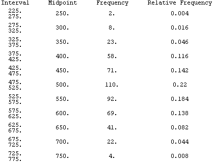
Frequency and Relative Frequency Tables
In constructing a frequency table for a single dataset you may only want to keep track of the number of values in each group. In comparing information from two datasets, you will want to make a relative frequency table where the relative frequency for a group is equal to the frequency for the group divided by the total frequency. The next table shows both the frequency and relative frequency tables for the above SAT math scores.
-
Histograms and Bar Graphs
Frequency tables and histograms are closely connected--histograms provide graphical representations of frequency tables. The next display shows the frequency and relative frequency histograms for the frequency and relative frequency tables just above.

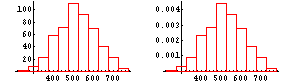
A histogram looks different as class widths are varied. When class widths are too small, the histogram will have too many bars, preventing you from recognizing patterns, while class widths that are too large will mask the general shape of the data set.
Go back to the Focus data shown above and make histograms for the SAT Math scores choosing several starting points and several interval widths. What statements can you make about the SAT Math scores based on the histograms that you have constructed.
Stem and Leaf Plots
Stem and Leaf Plots display information much like a histogram rotated through 90 degrees. In some cases individual data values that are lost when displaying the same information in a histogram are retained. Use the same Webstat applet shown above to make a stem and leaf plot of the SAT Math scores. What conclusions can you make from this?
Boxplots (Also called Box and Dot or Box and Whisker Plots)
You will discuss quartiles and medians further in the next section but briefly the median is a number with the property that half the numbers are greater than or equal to it and half are less than or equal to it. The first quartile is a number with the property that 1/4 of the numbers are less than or equal to it and 3/4 are greater than or equal to it. The third quartile is the 'reverse' of the first quartile.
A boxplot provides a graphical display of the smallest number, largest number, median value, and 1st and 3rd quartiles for a set of numbers. You can see a boxplot of the SAT Math scores by using the Webstat applet above and selecting the boxplot choice under Graphics. The left vertical line is above the lowest SAT Mathscore in the dataset, the right vertical line is above the highest SAT Math score, the left edge of the box is above the first quartile, the right edge above the third quartile, and the white line inside the box is above the median SAT Math score.