Name _________________________

CSC001- Major Assignment 4
Using Microsoft Excel to Create a Spreadsheet and Chart Data

ublkline620.GIF (83 bytes)

D. Joseph
Fall 1998

Due: Wednesday, November 11
Total Points: 30


This is NOT a group assignment!


I. What is Excel?

Microsoft Excel is a computer spreadsheet. A spreadsheet is a tool that helps you analyze and evaluate information. Spreadsheets are often used for budgeting, inventory management, and financial reporting. In your academic career you will mostly likely use Excel to chart data from a chemistry or physics lab.

In Excel the document you create is called a workbook. Each workbook is made up of individual worksheets, or sheets, just as a ledger book is made up of pages.

II. Purpose of Assignment

The purpose of this assignment is to learn how to create an Excel spreadsheet and graphically represent the spreadsheet data by creating a chart.

III. Starting Excel

  1. Click the Start button to display the Start menu.
  2. Point to Programs.
  3. Choose Microsoft Excel.
  4. Excel opens and a blank worksheet appears.

  5. If necessary, click the Maximize button  Maximize button  to maximize the application window.

The Excel Application Window

Figure 1.
The Excel application window.


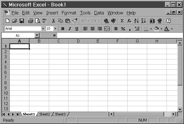
III. Components of the Excel Window

Take a moment to read about the Excel components listed below. Try to locate them on your screen.

Title bar. The title bar is located at the top of the window and it identifies the application. On your screen you see "Microsoft Excel - Book 1" in the title bar.

Title bar

Figure 2.
The title bar.


Menu bar. The menu bar is located directly below the title bar. Each word on the menu bar is the title of a menu you can open to see a list of commands and options. The menu bar gives you easy access to all features of the Excel spreadsheet program.

Menu bar

Figure 3.
The menu bar.


Toolbars. Two rows of buttons (or tools) and list boxes, located below the menu bar, make up the toolbars. The upper toolbar is the Standard toolbar and the lower toolbar is the Formatting toolbar. The buttons on the toolbars offer shortcuts for accessing Excel’s most commonly used features.

Standard toolbar

Figure 4.
The Standard toolbar.

Formatting toolbar

Figure 5.
The Formatting toolbar.


Formula Bar. The formula bar is located immediately below the toolbars. It displays the data you type or edit. The formula bar is also known as the formula pallet.

Formula bar

Figure 6.
The Formula bar.


Worksheet window. The document window, usually called the worksheet window, contains the sheet you are creating, editing, or using. The worksheet includes a series of vertical columns identified by lettered column headings and a series of horizontal rows identified by numbered row headings.

Column headings

Figure 7.
The column headings.
Row headings Figure 8. The row headings.


Cell. A cell is the rectangular area where a column and a row intersect. Each cell is identified by a cell reference, which is its column and row location. For example, the cell reference A1 indicates the cell where column A and row 1 intersect. The active cell, indicated by a black border, is the cell you select to work with. You can change the active cell when you want to work elsewhere in the worksheet.

Sample of cells in worksheet

Figure 9.
A sample of cells in the worksheet.
         Cell indicator

Figure 10.
Cell B3 is the active cell as indicated by the black border (cell indicator).


Name box. The name box is located at the left end of the formula bar. It identifies the selected cell, chart items, or drawing object.

Name box

Figure 11.
The Name box.


Pointer. The pointer is the indicator that moves on your screen as you move your mouse. The pointer changes shape to reflect the type of task you can perform at a particular location. When you move the pointer out in the grid area, it is a white plus sign. When you move it over the title bar, menu bar, and toolbars, it is a white arrow.

Mouse pointer over cells in worksheet

Figure 12.
The mouse pointer as it appears in the worksheet area.
Mouse pointer at top of window

Figure 13.
The mouse pointer as it appears over the top portion of the window.


Scroll bars. The vertical scroll bar (far right side of workbook window) and the horizontal scroll bar (lower right corner of workbook window) let you move quickly around the worksheet.

Vertical scroll barFigure 14. The vertical scroll bar. Horizontal scroll bar

Figure 15.
The horizontal scroll bar.


Sheet tabs. The sheet tabs let you move quickly between sheets by simply clicking the sheet tab. You can also use the sheet tab scroll buttons to see sheet tabs hidden from view.

Sheet tabs

Figure 16.
The sheet tab scroll buttons (left) and the sheet tabs (right).


Status bar. The status bar is near the bottom of the Excel window. The left side of the status bar briefly describes the current command or task in progress. The right side of the status bar shows the status of important keys such as caps lock and num lock.

Status bar

Figure 17.
The status bar.


IV. Getting Help

Excel provides an excellent online Help system. While you are working with Microsoft Office 97, an animated character called the Office Assistant pops up on your screen to help you work productively. As you work, you can ask the Office Assistant questions by typing your question, then clicking Search. The Office Assistant then shows you the answer to your question.

To use the Office Assistant

  1. Click the Office Assistant button. Office assistant button
  2. In the What Would You Like To Do area, type Learn about moving around in a worksheet.
  3. Click Search.
  4. Click the Move and scroll through a worksheet topic.
  5. Read the Help topic, and then click the Close button in the Help window.

    The Office Assistant "Super Pup"

    Figure 18.
    The Office Assistant.


V. The Assignment

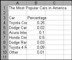
Enter Data in the Worksheet

When you type text in a cell, Excel aligns the text at the left side of the cell. Text that is too long to fit in a cell spills over into the cell or cells to the right, if those cells are empty. If the cells to the right are not empty, Excel displays only as much of the label as fits in the cell. When you type numbers in a cell, Excel aligns the number at the right side of the cell.

  1. Make sure that cell A1 is the active cell (the one with the dark border).
  2. In cell A1, type The Most Popular Cars in America.
  3. Press ENTER and A2 becomes the active cell.
  4. Press ENTER and A3 becomes the active cell.
  5. In cell A3, type Car.
  6. Press the TAB key and B3 becomes the active cell.
  7. In cell B3, type Percentage.
  8. Use the mouse to click cell A4 to make it the active cell.
  9. In cell A4, type Toyota Corolla and press the TAB key to move to cell B4 and type .25
  10. In cell A5, type Dodge Caravan and press the TAB key to move to cell B5 and type .02
  11. In cell A6, type Acura Integra and press the TAB key to move to cell B6 and type .1
  12. In cell A7, type Honda Civic and press the TAB key to move to cell B7 and type .5
  13. In cell A8, type Dodge Ram and press the TAB key to move to cell B8 and type .03
  14. In cell A9, type Toyota 4 Runner and press the TAB key to move to cell B9 and type .09
  15. In cell A10, type Other and press the TAB key to move to cell B10 and type .01


Your worksheet should resemble the following:

Your worksheet should look like this
Figure 19. Your worksheet data after it has been entered into the spreadsheet.

Save Your Work

When you save a workbook, you copy if from RAM (memory) onto your disk. Excel has more than one Save command on the File menu. Most often you'll use the Save and Save As commands. The Save command copies the workbook onto a disk using its current filename, if an old version of a file exists, the new version replaces the old one. The Save As command asks for a filename before copying the workbook onto a disk. WHen you enter a new filename, you save the current file under that new name. The previous version of the file remains on the disk under its original name.

  1. Make sure you have a floppy disk in drive A.
  2. Choose Save As from the File menu and the Save As dialog box appears.
  3. Click the Save in list arrow and select 3 ½ Floppy (A:).
  4. Type Major4 in the File name text box.
  5. Click the Save button in the Save As dialog box to save the file.

The dialog box closes and you return to the document window. The name of your file (Major4.xls) appears in the title bar.

Format the Cell Contents

Formatting is the process of changing the appearance of the contents of the worksheet cells. Formatting can make your worksheet easier to understand.

  1. Click cell A1 to make it the active cell.

  2. Click the Bold button Bold button and the title becomes bold.

  3. Use the mouse to select cells A3 and B3.
    To do this, move your mouse pointer (the white plus) over cell A3 and click to select the cell. Then with your mouse pointer still over cell A3 press and hold down the left mouse button and drag (move) toward the right to highlight both A3 and B3. Release the left mouse button.

  4. Click the Bold button and the column labels become bold.

  5. Use the mouse to select (highlight) cells B4 through B10.
    To do this, move your mouse pointer (the white plus) over cell B4 and click to select the cell. Then with your mouse pointer still over cell B4 press and hold down the left mouse button and drag (move) downward to highlight all the cells between B4 and B10 inclusive. Release the left mouse button.

  6. Click the Percent Style button percents.gif (879 bytes)   and the values in the selected cells are now percentages.

  7. Click the Center Align button center.gif (893 bytes)  and the cell contents are centered within the cells.

  8. Click outside of the highlighted cells to deselect them.

  9. Select columns A and B by clicking the column header for column A and dragging across to column B.

  10. Open the Format menu, point to Columns, and then choose AutoFit Selection. The AutoFit command adjusts each column width to accomodate the widest entry in the column.

  11. Click the Save button save.gif (909 bytes)  to save your work.

Chart the Data

It’s easy to visually represent worksheet data. You might think of graphical representations as graphs; however, in Excel they are referred to as charts. There are 15 different chart types that you can use to represent worksheet data:

Area chart Radar chart 3-D Column chart
Bar chart XY chart 3-D Line chart
Column chart Combination chart 3-D Pie chart
Line chart 3-D Area chart 3-D Surface chart
Pie chart 3-D Bar chart Doughnut chart


Each chart type has several predefined chart formats that specify format characteristics such as gridlines, chart labels, axes, and so on. You can find more information on chart types and formats in the Excel Help facility and in the Chart Wizard.

Understanding Chart Terminology

Understanding the Excel chart terminology is particularly important if you want to successfully construct adn edit charts. Take a moment to review the terms below.

  • Chart title. Identifies the chart.
  • Category axis or x-axis. The horizontal axis of the chart.
  • Value axis or y-axis. The vertical axis of the chart.
  • Axis title. Each axis on a chart can have a title that identifies the scale or categories of the chart data.
  • Tick mark label. Shows the scale for the y-axis. Excel automatically generates this scale based on the values selected for the chart.
  • Category names or category labels. Usually displayed on the x-axis; correspond to the labels you use for the worksheet data.
  • Data point. A single value in a cell in the worksheet.
  • Data marker. A bar, area, wedge, or symbol that makes a single data point on a chart.
  • Data series. A group of related data points. When you have more than one data series, your chart will contain more than one set of data markers.
  • Legend. Identifies which data markers represent each data series. When you show more than one data series on a chart, it is a good idea to use a legend.

Let's create the chart...

  1. Select cells A3 through B10.
  2. Click the ChartWizard button Chart wizard  to go open Step 1 of the ChartWizard
  3. Choose Pie as the Chart Type.
  4. Choose Pie with 3-D visual effect (2nd option in 1st row) for the Chart sub-type.
  5. Click the Next button to move to Step 2.
  6. Click the Next button to move to Step 3.
  7. Click the Titles tab (at top of dialog box) if necessary.
  8. In the Titles box, type Most Popular Cars in America.
  9. Click the Data Labels tab.
  10. Choose Show percent.
  11. Click the Next button to move to Step 4 of the ChartWizard.
  12. Select As new sheet Chart1. A chart is created on a new worksheet.
  13. Click the Save button to save your work.

How to Get Credit for the Assignment

In an effort to save paper and printing time, please just show your work (on screen) to your instructor rather than printing it out.


ublkline620.GIF (83 bytes)

Return to:  CSUS | Computer Science

October 26, 1998
Comments to:  josephd@csus.edu